Newsletter Accessibility
Use an email marketing platform that is more accessible than a PDF. If distributing as a PDF, follow the accessible PDF guidance.
Download the Newsletter Accessibility Best Practices Checklist for a handy reference at your fingertips.
Layout
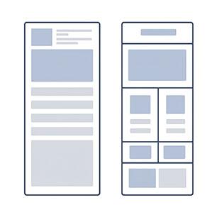
Use a single-column, simple layout. If you use two columns, be sure to use proper heading structure. A two-column design needs to be responsive, collapsing to a single column on mobile phones.
Never use tables as a way to layout content. Use the native tools within the editor to create columns.
Use Headings and Structure
Structure your content under headings. This will allow screen readers to navigate the text logically and visual readers to skim the content.
Start with an H1, usually reserved for the title, then arrange the content in order (H2, H3, etc.) without skipping a heading level.
Bolding or enlarging text does not structure the content in a helpful way.
Use Clear, Readable Fonts
Choose fonts that are easy to read, such as Arial, Verdana, or Calibri. Avoid decorative fonts or ones that look like script. Use a font size of at least 12 to 14 pt for normal text in newsletters. Headings can be 16 pt. Align text to the left, including headings.
Reserve underlined text for hyperlinks only. Avoid all caps because they decrease readability.
Maintain High Contrast
There must be a strong contrast between text and background. Avoid busy backgrounds and low-contrast color combinations, such as ETSU gold and white.
Minimum Thresholds (Level AA)
- Normal Text: Requires a contrast ratio of at least 4.5:1.
- Large Text and UI Elements: Requires a ratio of at least 3.0:1 (large text is defined as 18 pt or 14 pt bold).
Use the WebAIM Color Contrast Checker to check your document’s color contrast.
Add Alt Text to Images
Images should have alternative text (alt text) to describe them. Assistive technology reads the alt text to users who are blind or have low vision. Alt text is limited to 125 characters, so keep it concise.
Never embed important text inside an image without also including it in alt text or a caption.
Example:

Instead of: A student walking on campus.
Use: A student walks across the ETSU Commons on a sunny day.
Make Links Descriptive
Avoid using links with vague text, like “click here.” Instead, use descriptive language that tells the reader where the link goes or what it does.
Example:
Instead of: Click here for more info.
Use: Read the full news story on the ETSU News website.
Avoid: Click Here, Link, More Info, Video, PDF
Accessible PDF Design
If you convert your newsletter to a PDF, make the PDF accessible.
- Run the Acrobat Pro Accessibility Checker
- Complete two manual checks:
- Logical Reading Order
- Color Contrast
- Tag headings, lists, and tables are properly
- Add alt text to images
- Set Document Properties as follows:
- Display the Title rather than the Filename
- Enable Single Page Continuous Scrolling
- Set the Language correctly
Emojis
- Limit to two or fewer.
- Avoid consecutive emojis.
- Place at the start or end of text, not mid-sentence.
- Emojis with modified skin tone or color have a longer description, so use them sparingly.
- Do not use emojis to convey meaning.
GIFs
GIFs are short, looping animations sometimes used in email newsletters.
Not all platforms support alt text for GIFs, which means some users may not be able to understand them. Therefore, do not rely on a GIF alone to communicate your message.
When using a GIF:
- Ensure the message makes sense without the GIF.
- Use alt text or a short description that explains what the GIF shows.
- Avoid flashing GIFs or ones with hard-to-read text.
Buttons/CTAs
- Make buttons 44–48 px high so they are easy to tap on mobile devices.
- Add padding so the tappable area extends beyond the button.
- Leave space between buttons to prevent mis-taps.
- Use a button text size of at least 16 px.
- Use descriptive button text, not "Click here."